


I thought it would be a good idea if i took various words out of newspapers and create a collage representation. It showcases words that represents Type 1 diabetes in both views. I placed an 'x' on a few negative words and circled positive words. This was a way of showing myths about diabetes, this I feel could would well in my animation as it is attention grabbing. If I am going to use this general idea in my animation I will be using selected words, as there are too many words in the image to your right . A its looks quite distracting and would not actually put the message across effectively.
MIXED MEDIA
Experimenting with paints and paper textures. I wanted to give a quirky feel to my work through adding a "pop of colour", as this would highlight the message am trying to put across about Type 1 Diabetes.


CHARACTER DEVELOPMENT
Process of creating my character for my animation.


CHOSEN CHARACTER DESIGN
Final sketches of chosen character, named Sarah Jones. I wanted to show various emotions and reactions in Sarah's face.
WRITTEN REPORT
Visiting the library to research and view books that could be used within my written report. I made various notes of these in my notebook. I also spent time online looking at how to structure a dissertation. From this I then started typing up my chapters and bullet pointing what is needed in each section. This was so I could go back and forth and know what was needed.


DIGITALISING SKETCHES
Brought my character sketches into Adobe Illustrator and digitally created them. The simple outline effect works as it makes the image the main focus.


CHARACTER BACKGROUND STORY
My chosen character is Sarah Forbes, creating a background for Sarah was very important as it makes her more reliable and friendly. The style of my vector illustrations will be simple outlines as this way my character can represent any race and ethnicity.


#1 - SCRIPT
This is my first script I created for my animation, which is based on the myths of type 1 diabetes and how it affects the individual.


#1 - STORYBOARD
To create my animation, I firstly needed to create a storyboard so that I would be able tell a story effectively. As you can see this is a quick and rough storyboard.


#2 - SCRIPT
For my second script I added various lines that I felt was missing in the first and made the animation more interesting and meaningful. I also noticed their was a few spelling errors in my first one. I highlighted the sentences that are being spoken by my character in red so it was easier to follow.


#2 - STORYBOARD
For my second storyboard, I made sure it was more professional looking. I also added action shots, so that it was more clear what was happening throughout the storyboard.


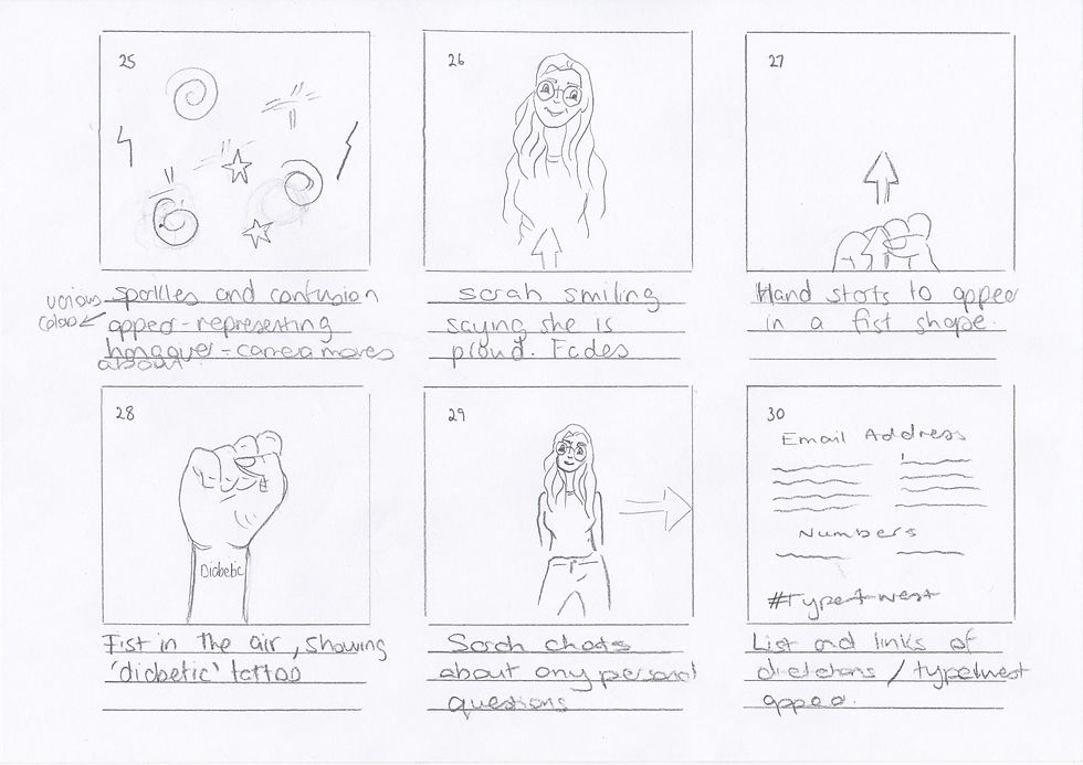
FINAL STORYBOARD
Looking at my previous storyboards I wasn't happy , in my final storyboard i decide to simpfily and create a more icon based animation. Not only would this be clearer in telling the story but it would show my graphic skills in adobe illustrator. This storyboard allowed me to truly define my animation.


QUICK ICON SKETCHES
Quickly drew small icons to give me a brief idea of what I was going to create in my animation.


ICONS
For my animation I wanted to create various icons to represent certain aspects especially to represent people as it could represent anyone and this is what I want, I didn't want to narrow it down to a particular gender.


TYPOGRAPHY
One of our challenges was to create a typography style sheet within in 24 hours. Here you can see two examples of the style of typography I want to go for. This being simple but clear, its important that the writing is not only clear but appealing.

Played around with colours in Adobe Colour CC

Chosen colour scheme

Played around with colours in Adobe Colour CC
EMOTIONAL TRIGGERS OF COLOURS
After creating colour schemes in Adobe Colour CC, I decided to look into colour psychology. The use of colour will grab the attention of the viewer and create an emotion which is needed in my animation to communicate the message. As you can see I have listed the reasons why I choose each colour to back my concept.
UPDATE: 3RD APRIL 2017
On the 27th March I under went surgery to remove a nerve sheath tumor from the inside of my upper arm that was the size of a golf ball, in Dundonald Ulster Hospital in Belfast. This has set me back on my project, as the doctor stated to me that it would take 3 weeks recovery at least, due to me having to gain power back in my arm and for me to heal. But with having diabetes it may take even longer , as I'am a slow healer. Currently this is a week after my surgery and there isn't much movement in my arm and am still very sore.
ANIMATE
First Animate for my first storyboard. This was a quick example that allowed me to see the length of animation and to see if my voice over suited my animation. Personally I feel that the voice over needed to be someone that has diabetes, so that it was more meaningful and relatable.


Mouth shapes I created in Adobe Illustrator, to create my lip sync.

I tried to keep myself fairly organised with pre composing and naming folders to keep everything together
VOICE OVER/LIP SYNC/SOUND
For the voice over for my animation I felt it was important that it was a diabetic speaking so that it would be more meaningful for fellow diabetics. So this is why I decided to use my very own voice, as I have my very own personal experiences and with my northern Irish accent people could relate more too. For my voice clips I organised them into separate sections. For the sound of the party pooper I downloaded a sound from https://www.freesound.org/people/dmjames/sounds/140095/


RULE OF THIRD , GRIDS AND GUIDES
Using the rule of thirds to draw interest to certain areas of my animation in Illustrator I have used this composition technique in previous animations and allows one image to flow from one to the next smoothly.I also used the grids and guides within aftereffects to make sure illustrations such as the icons and text are lined up and look correct.
TESTING OUT WATER EFFECT
Attempting to see if the water colour effect would work on the sketches, I felt it didn't as it made Sarah less attention grabbing.

Colour over simple line illustrations didn't work.


I thought the text over the splash of colour worked out much better, and the added text makes it more clearer.
Colour over simple line illustrations didn't work.
TRANSITIONS
Possible example of an transition.
TRANSITIONS
Another example of a possible watercolour effect which will possibly be used for animation to add a pop of colour and reveal the simple line illustrations.
To create my watercolour effect, I created various jpegs in Adobe Photoshop with various brushes.To create this overall effect I used keyframes and effects in Aftereffects.


Paper texture downloaded from the internet
NEW BACKGROUND
Previously I was using a paper effect in my background , but I decided to change this because I felt it was too distracting and took away fro the actual image. The use of this ivory coloured background i felt worked great as the image jumps out from the image more so and it hasnt as harsh as white.


TEST
Test attempt with the watercolour reveal effect and lip sync, yet to include text.
TEST 2
Test attempt of part of my animation, as you can see there is a few mistakes such as lip syncing and timing issues that I need to resolve. Testing allowed me to fully see and determine where the errors are. This animation is for my final storyboard as I changed my idea.
Aftereffects
RENDERING PROBLEMS
When rendering my final animation, I had several problems, firstly my laptop kept alerting me with the warning ram disk full and it was not, I couldn't view my animation in full quality. This then mean't that I was unable to render the full animation in one go at this point as it kept cutting of. To solve this problem I had two split the animation and render the individually and join them together. This made a small error and ruined the animation. So then after a while I left my laptop alone for a few hours seeing as though I had been working on it flat out for few weeks. I chanced my luck, and changed the memory preferences in after effects and finally after the seventh attempt it allowed me to render the entire animation.